Upload date
All time
Last hour
Today
This week
This month
This year
Type
All
Video
Channel
Playlist
Movie
Duration
Short (< 4 minutes)
Medium (4-20 minutes)
Long (> 20 minutes)
Sort by
Relevance
Rating
View count
Features
HD
Subtitles/CC
Creative Commons
3D
Live
4K
360°
VR180
HDR
75,608 results
python plotly dash
python bokeh
plotly express
Colab Notebook: https://colab.research.google.com/drive/1wxI23X7EzV2-DlWU7F0iIeTSTV2OPYTy?usp=sharing Thank you for ...
35,422 views
3 years ago
Unlock the full potential of Python for data visualization in just 1.5 hours with this comprehensive Plotly tutorial. Perfect for ...
9,684 views
2 years ago
An introduction to the Dash web application framework. Dash is used to create browser-based interactive data visualization ...
852,066 views
5 years ago
In this video, you'll learn how to build a simple and interactive dashboard using Python and the Dash framework. Dash is a ...
748,082 views
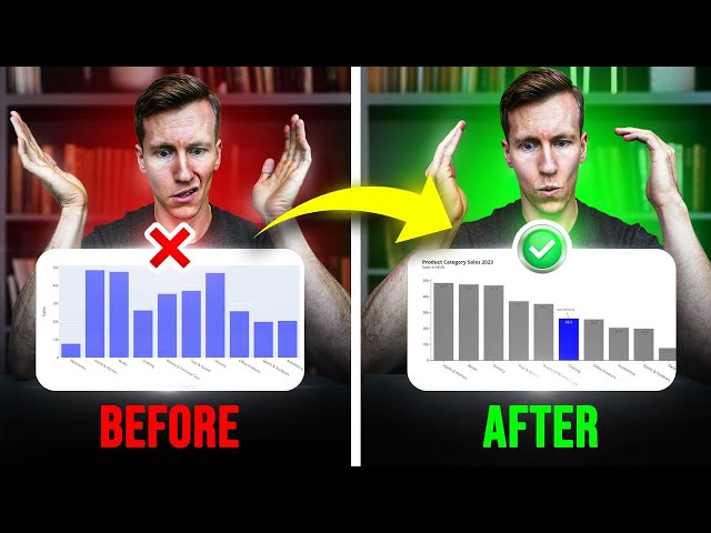
Tired of manipulating Excel dashboards with complex VBA macros? In this tutorial, you'll discover a comprehensive workflow I use ...
153,125 views
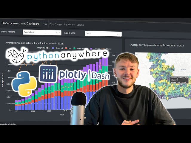
My Dashboard: https://www.thepropertydashboard.co.uk/ Project GitHub: https://github.com/harryallum/Dash-Property-Dashboard ...
26,337 views
1 year ago
Get your Free Python Starter Course ~ https://tinyurl.com/2kjh4n4r Join 9k+ Readers — Python Newsletter ...
22,230 views
Join my Python Masterclass - https://www.zerotoknowing.com/join-now Join my Python Newsletter ...
9,552 views
Playlist: https://www.youtube.com/playlist?list=PLNmsVeXQZj7pb4apqIMKvCz37t_dLznMm ❤❤❤ Early access to tutorials, polls, live ...
19,728 views
4 years ago
Get started with DataCamp and their Finance with Python track today! https://datacamp.pxf.io/RGZMVb In this video, I'll show you ...
110,639 views
7 months ago
In this video, I will provide a high-level overview of the Top 5 Python libraries for Data Visualization that you can use to create ...
54,264 views
Master Python and Build Awesome AI Projects https://python-course-earlybird.framer.website/?&utm_source=pyvizdash ...
581,352 views
A choropleth map is a type of thematic map in which areas are shaded or patterned in proportion to a statistical variable that ...
100,914 views
New Data Science / Machine Learning Video Everyday at 1 PM EST!!! [ Click Notification Bell ] This video provides complete ...
261,218 views
In this video Rob, a Kaggle Grandmaster, quickly and humorously walks through each of the popular plotting and data ...
106,443 views
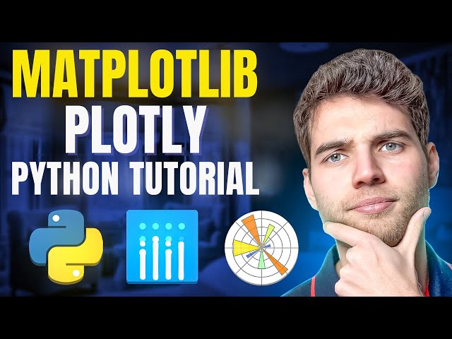
In this video we take a quick look at the Plotly framework in Python. At the end we compare it to Matplotlib.
104,518 views
Tired of Matplotlib's outdated approach? Discover these 5 powerful Python libraries that offer cleaner, more intuitive, and often ...
7,024 views
Learn the quickest way to build a Python Dashboard with ChatGPT Plotly and Dash. We'll show you two separate dashboards, ...
74,468 views
Explore All My Excel Solutions: https://pythonandvba.com/solutions DESCRIPTION ...
8,740 views
Fala, pessoal! Esse é o primeiro vídeo de uma série sobre o Plotly, uma biblioteca do Python de plotagem interativa e de código ...
16,436 views
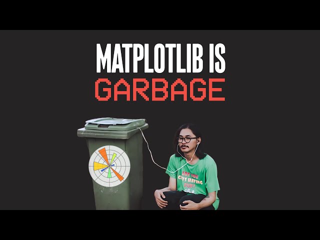
In this video, I cover the top 2 Python libraries for data visualisation: Matplotlib and Plotly. Matplotlib is the most well-known and ...
728 views
6 months ago
Learn to build Python data apps and data visualizations with Dash by Plotly. This is a detailed overview of Dash as well as a demo ...
30,779 views
Data visualization is an import part of working with data and Python has many libraries that allow you to display a wide range of ...
7,958 views
ai #python #codanics #artificialintelligence #urdu We will cover this: https://codanics.com/data-visualization-in-data-science/ This ...
6,242 views
Streamed 2 years ago