ViewTube

ViewTube
Sign inSign upSubscriptions
Filters

Upload date

Type

Duration

Sort by

Features

Reset

91 results

Stat 201 at UTK
Excel Tutorials - Side By Side Boxplots (Mac)

How to make side-by-side boxplots on a Mac using Excel.

2:34
Excel Tutorials - Side By Side Boxplots (Mac)

106 views

2 days ago

Excel Campus - Jon
Create an Eye-Catching Star Rating Chart in Excel ⭐️ | Fast & Easy Tutorial

Learn how to create an eye-catching star rating chart in Excel! Follow our step-by-step guide to visualize feedback and ratings ...

1:31
Create an Eye-Catching Star Rating Chart in Excel ⭐️ | Fast & Easy Tutorial

9,417 views

4 days ago

VBA-Kracher Held-office
Video 457: Excel Trick: Mini-Charts Directly in the Cell via Macro! 📊⚡ — Sparklines Explained

In this short video, I'll show you how to insert sparklines in Excel—those small but incredibly helpful mini-charts directly ...

9:08
Video 457: Excel Trick: Mini-Charts Directly in the Cell via Macro! 📊⚡ — Sparklines Explained

80 views

6 days ago

AIIQData
AI Data Visualization — Automatic Charts, Trends & Correlation Analysis | AIIQData

See how AIIQData instantly converts your spreadsheets into automatic data visualizations. Upload a CSV or Excel file and get ...

0:22
AI Data Visualization — Automatic Charts, Trends & Correlation Analysis | AIIQData

3 views

7 days ago

Flowealth Academy
Data Visualization in Excel | Create Interactive Charts & Dashboards | The Flowealth Academy

Want to turn boring spreadsheets into beautiful, insightful visuals? In this beginner-friendly tutorial, The Flowealth Academy ...

11:44
Data Visualization in Excel | Create Interactive Charts & Dashboards | The Flowealth Academy

15 views

6 days ago

Aki Stepinska
Excel Dashboard Tutorial | Custom Colors, Themes & Charts Step-by-Step

Learn how to build a professional Excel dashboard — no pivot ...

51:30
Excel Dashboard Tutorial | Custom Colors, Themes & Charts Step-by-Step

58 views

4 days ago

Daniel Awinsobira Mba
How to Visualize Quantitative Data (Step-by-Step Tutorial for Beginners)

Types of charts for quantitative data (histograms, box plots, scatter plots, etc.) - How to choose the right chart type - Step-by-step ...

13:50
How to Visualize Quantitative Data (Step-by-Step Tutorial for Beginners)

0 views

7 days ago

First Steps in Excel
12 - Excel Challenge: Create Your First Chart 📊 | Excel for Beginners

Quick Excel Challenge: It's your turn to bring your data to life using charts! Follow along step by step: ✔️ Create a simple table ...

1:08
12 - Excel Challenge: Create Your First Chart 📊 | Excel for Beginners

1,077 views

5 days ago

Ehrman AP Precalculus and BC Calculus
Semi Log Practice KEY
7:44
Semi Log Practice KEY

0 views

6 days ago

Excel Lab PK
🔥 Excel Dashboard 2025: 12 Hacks for Fully Interactive Charts

Excel Dashboard 2025: 12 Hacks for Fully Interactive Charts Learn 12 powerful Excel Dashboard hacks that will instantly make ...

28:29
🔥 Excel Dashboard 2025: 12 Hacks for Fully Interactive Charts

39 views

1 day ago

StataCorp LLC
What's it like–Getting started in Stata 19

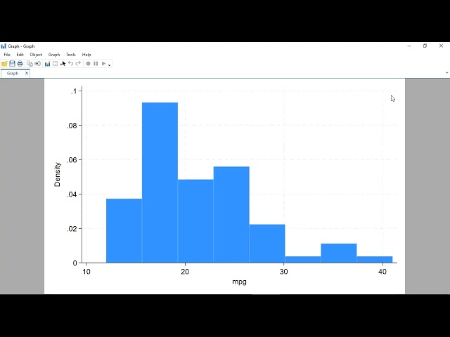
Want to know how to conduct a basic data analysis using Stata 19? We show you just that. Watch as we show you how to import ...

28:06
What's it like–Getting started in Stata 19

202 views

4 days ago

AllinOne
Lecture 4 - Distribution Charts And Blending Data

Drag Box Plot → View # What it shows: * Q1, Median, Q3 * Minimum–Maximum * Outliers (points outside whiskers) # C. Scatter ...

16:20
Lecture 4 - Distribution Charts And Blending Data

0 views

6 days ago

V2V EdTech
DATA ANALYTICS | Special Lecture | TY DIPLOMA | K - Scheme 💻🚀

Welcome to V2V Classes – Your Gateway to Diploma Success! Unlock your potential ,whether you're from FY, SY, or TY, we've ...

3:52:53
DATA ANALYTICS | Special Lecture | TY DIPLOMA | K - Scheme 💻🚀

6,268 views

Streamed 7 days ago

Priya Bhatia
Data Analyst Roadmap for 2026!

Thinking about becoming a Data Analyst in 2026? Or planning to move into this field from a non-tech background? This video ...

27:41
Data Analyst Roadmap for 2026!

730 views

5 days ago

Stat 201 at UTK
Office Hours - November 18th - Project Part Two

0:00 - Start Of Stream 1:53 - Task 4 - Side-by-side box plots 14:23 - Task 5 - Pivot Charts 21:23 - Task 6 - Regression 27:42 - Task ...

37:09
Office Hours - November 18th - Project Part Two

579 views

Streamed 5 days ago

EZMathTV
EZMathTV Test for Normality StatCrunch QQ Plot Solved Example

From spreadsheets and using functions in Excel, we expand our platform to include functions in a scripting or command ...

13:14
EZMathTV Test for Normality StatCrunch QQ Plot Solved Example

0 views

2 days ago

Stat 201 at UTK
Office Hours - November 19th - Project Part Three

0:00 - Start Of Stream 2:23 - MOST IMPORTANT - Getting all the Points 5:53 - MOST IMPORTANT - You need amazing ...

1:00:55
Office Hours - November 19th - Project Part Three

285 views

Streamed 4 days ago

BioTech Whisperer
Tools for Data Representation in Biomedical Research (15 Minutes)

... in central tendency making them a go-to choice for exploratory data analysis most statistical and graphing tools support box plot ...

14:47
Tools for Data Representation in Biomedical Research (15 Minutes)

3 views

3 days ago

iTRACK Solutions
#minitab : How to draw #pareto chart in #minitab - Part2  With variables

... #ProcessControl #QualityTools #DataDrivenDecisions #businessanalyticscourse #BoxPlot #Histogram #ControlChart #SPC ...

3:00
#minitab : How to draw #pareto chart in #minitab - Part2 With variables

230 views

7 days ago

Leon Shpaner
JupyterCon 2025 - EDA Toolkit Tutorial on Streamlining Exploratory Data Analysis in Jupyter

EDA Toolkit is an open source Python library that simplifies and accelerates exploratory data analysis in Jupyter notebooks.

24:05
JupyterCon 2025 - EDA Toolkit Tutorial on Streamlining Exploratory Data Analysis in Jupyter

12 views

3 days ago